Facts About Interior Design
 Understanding the basics of interior design can be of great benefit to anyone, whether you aspire to make a career out of it or just want to decorate your living room. By following the principles of design, you can achieve the look of a professionally decorated room without actually hiring a designer or decorator.
Scale and Proportion
What is Scale?
Scale relates to the size of objects such as furniture in relation to the size of the room. General rules of thumb for scale:
- Large-scale furniture should be used in large rooms.
- Tall, imposing pieces emphasize the vertical space in rooms with high ceilings.
- Smaller, lighter furniture with less visual weight works better in small rooms.
As with all rules, there are exceptions that can help create dramatic interiors. Here are two examples of breaking the rules in terms of scale:
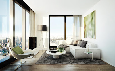
- It’s not uncommon to find low-profile, modern furniture in a contemporary great room with a vaulted ceiling.
- A large bed can be used in a small bedroom as long as it doesn’t block the natural sight lines of the room and is within the same color palette as the surroundings.
What is Proportion?
Proportion deals with the size of objects in relation to each other and the room as a whole.
The rule of thirds is useful in proper proportion. For example:
- A coffee table should be two thirds the width of the sofa.
- Artwork hung above furniture should be two thirds the width of the furniture beneath.
Rhythm and Harmony
Rhythm Explained
Create rhythm by repeating colors, patterns or shapes for a pleasing flow that keeps the eye moving throughout the room. For example:
- Pull a bright color from a painting, area rug or ceramic art and repeat it on curtains, accent pillows and lampshades.
- Repeat shapes in a room with similar fabric patterns, such as floral prints in varying sizes, multiple square, rectangular or oval frames, bell-shaped shades on table lamps, floor lamps and wall sconces or painted vertical stripes on a wall.
Harmony Explained
Bring harmony to a room by unifying elements in a design scheme. For example:
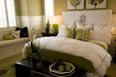
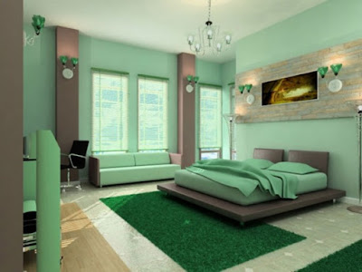
- A monochromatic color scheme, which uses varying shades and tints of the same color, appears harmonious to the eye.
- Natural, earthy textures from wood, stone and woven vines or grasses can tie a room together.
- The sleek finishes on glass, metal and lacquered furniture can bring harmony to a contemporary space.
Balance in Three Ways
Balance relates to equilibrium in a room or the equal distribution of visual weight. The three methods of balance include:
Symmetrical – A display where one side mirrors the other side, such as a mirror in between two identical wall sconces or an even number of framed prints in the same size hung in a square grid. Symmetrical displays are more common in formal settings.
Asymmetrical – A display that includes objects of varying sizes or shapes organized in a way that balances their visual weight, such as a floor lamp on one side of the sofa and a medium-sized potted plant on the other. Asymmetrical displays are more common in casual settings.
Radial – Less commonly seen, radial symmetry occurs when objects are arranged around a central point, such as a round dining table with place settings and chairs arranged in a circle.
Tip :Emphasis or Focal Points
Dark colors have more visual weight than light colors and solid furniture pieces without legs appear heavier than those with legs. Keep this in mind when arranging furniture and decor to ensure the visual weight is evenly distributed throughout the room.
A well-designed room always has a dominant feature or focal point. By emphasizing a focal point, the eye is naturally drawn to the architectural feature or object intended to enhance the room’s design.
A large living room or great room often has more than one focal point, such as a fireplace and large viewing window or a large piece of wall art or a sculpture.
How to Create a Focal Point
To help a focal point take center stage, use contrasting colors, forms or textures and focused lighting in creative ways. Using a combination of these design elements increases the impact. For example:
Light and Texture Focus recessed lights on a stone veneer accent wall.
Texture and Forms Use an accent wall to enhance architectural forms, such as a fireplace, staircase or bay window.
Color and Light Add a colorful bed or painting and make it the focal point with focused lighting.


Interesting and knowledgeable information you have shared about the interior design.
ReplyDeleteResidential Architects London
Planning Enforcement Appeals